3
$\begingroup$

I have the results of 2 separate jobs that contain a set of 75 circuits each. I am trying to compare these jobs by plotting the average counts from all the circuits in job 1 vs the average counts from all the circuits in job 2 on a single histogram plot.

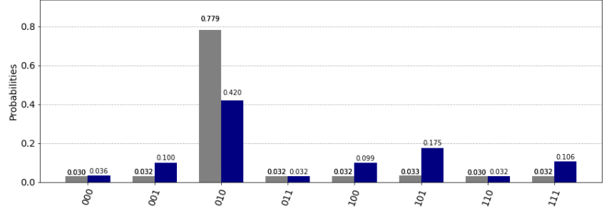
The image below is an example of what I am looking to create where the grey counts would be the average from the circuits in job 1 and the blue counts would be the average from the circuits in job 2.

enter image description here

Is this possible? What is the best way to go about creating this plot?

Thanks in advance!

$\endgroup$

1 Answer 1

1
$\begingroup$

Yes, I have checked the code and find out that this is possible.

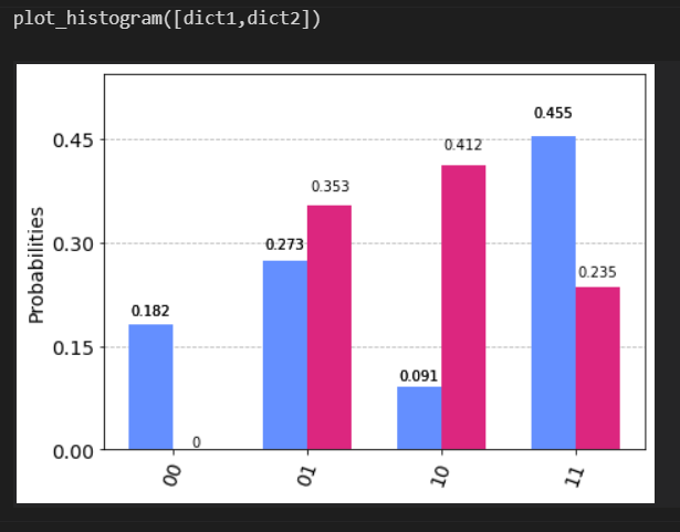
The qiskit function plot_histogram takes two types of input as the data: either a single dictionary or a list of dictionaries, so what you need is get the two distinct counts(that are two dictionaries) and then combine them into a list.

Here comes a simple illustration.

from qiskit.visualization import plot_histogram
dict1={'00':2,'01':3,'10':1,'11':5}
dict2={'00':0,'01':6,'10':7,'11':4}
plot_histogram([dict1,dict2])

and the resulting bar plot will be

enter image description here

$\endgroup$

Your Answer

By clicking “Post Your Answer”, you agree to our terms of service and acknowledge you have read our privacy policy.

Not the answer you're looking for? Browse other questions tagged or ask your own question.